Showing posts with label OUGD404. Show all posts
Showing posts with label OUGD404. Show all posts
Sunday, 15 April 2018
End of module evaluation
Overall, this module has been helpful in learning key practices used in graphic design. With the learning of colour theory and grid systems, key theories of which can be used throughout all graphic design work. The colour theory publication allowed the learning of the theories and experimentation with the practical work, which was a fun task. The grid system publication allowed the learning and applying of how to uses different grids, which a transferable skill that has already been valuable with the use of using grids for design boards. The designing of the book covers helped me to learn skills of how to stay away from the obvious imagery when designing, with also how to use grids in order to create the layouts. The brief allowed experimentation with the use of different methods and styles of approaching our chosen books which was valuable and interesting. The limitations to this module was perhaps the research into designers and practices which could have inspired different techniques for the book covers. Also, perhaps more experimentation could have been done with using more imagery for the book covers, having more variations to choose from and to see what works best. Overall, the module has allowed the theories learnt to become transferable in the foreseeable future within my graphic design work, and has allowed me to learn how to use different techniques of design that strays away from the obvious.
Wednesday, 11 April 2018
Final covers


Printed out versions:


From the last critique of the covers, they have been further experimented and developed in order to reach the final outcome. From the feedback that having the flowers on the title may overpower the front and to maybe just have them on the spine, the Hygge spine was changed in order to feature the flowers. This meant that all spines feature the folk pattern design which shows the coherence between the books and equals an interesting design feature for when the book is on a shelf. Also with feedback that the blurbs on the back covers should all use the same type, they were changed to all use Helvetica type in 12 and 11 point, in order to try and keep the similarities between the design features of the covers. Also, an added grid was used in order to place the front illustrations in the same place, whilst also making sure the barcodes were in the same adding a coherence to the designs. The back cover illustrations were developed as both Lykke's and Hygge's was moved more towards the barcode to show the integration more, and Hygge's had less of a gap between them both. The colours were kept the same because of them effectively conveying the tone of voice and genre. The covers were printed on museum heritage, which is a textured paper, of which proved successful as it reflects the book's illustration hand drawn style and also reflects the popular trend of illustration style books of which are out in the market.
Final colour theory and Grid system publications
For the final colour theory publication, the paper stock and bound was developed, with using cartridge paper which added an effect to the image which resembled denim, proving to be effective. The publication has been bound with a staple, with laser cutting the edges to get a straight edge. The publications order has been changed to keep it clear to what colour theory the images are demonstrating, with creating sections for each colour theory, with adding the research images into the corresponding ones.
For the final grid system publication, the publication has been changed from having a book full of different paper stocks and lots of examples randomly, to an organised bound publication. The final publication condenses the most important information and uses made grid system examples with the magazine examples to more effectively show the research. The publication has titles to make it clear what section is what, as this was a problem with the 1st publication. The publication is smaller and landscape bound to make it different and interesting, with the booklet format been easier to read than A4 sheets of paper that I had before.
For the final grid system publication, the publication has been changed from having a book full of different paper stocks and lots of examples randomly, to an organised bound publication. The final publication condenses the most important information and uses made grid system examples with the magazine examples to more effectively show the research. The publication has titles to make it clear what section is what, as this was a problem with the 1st publication. The publication is smaller and landscape bound to make it different and interesting, with the booklet format been easier to read than A4 sheets of paper that I had before.
Saturday, 7 April 2018
Book cover developments
From the critique that the book covers are coherent with the illustrations and the use of the colours expresses the books well, little details were experimented and changed with before ending up with the final covers. With the critique that for the cover 'Hygge' the spine should feature the Scandinavia folk pattern flowers instead of the book and teacup, the spine was changed to which created an interesting design feature of which would show the covers coherence when seen on a book shelf. Also, with the critique that perhaps the title isn't appearing to the eye, the colour was changed to be filled in black, however this didn't work with the aesthetic of the covers with it being too harsh. The blurbs of the back covers were changed to make sure the text was the same, with all using Helvetica, following the format of the existing covers. A grid was used as with feedback it was said that the illustrations aren't in the same place, so a grid was used to make sure the layout was the same with the illustrations, barcode and authors name. With feedback that they weren't sure about the flowers on the cover, the covers were experimented with taking away the flowers and just keeping them on the spine, however it was decided that they add to the design, making it more interesting.
Saturday, 20 January 2018
chosen development book cover critique
colour purple is nice and expresses what you talk about
titles are not appearing to the eye, hand cross stitch for the final covers will pull the production together
blurb should have a consistent use of type
authors name and title are too contrasting making the page feel unbalanced
the use of typography makes them work as a set but you should pick a background colour for the 'hygge' to make it fit the others.
the ideas and concept translate very well through the visual language
maybe the typeface should be bigger and interact more with the flowers
like the colour and three covers, with them expressing what you're trying to say
like the use of different colours
the colour used for 'Lykke' may have a better choice
overall ideas of the books are great and relate to the visual language
love the typography, works well with the rest of the design
not sure about the flowers as it over powers the type, maybe on one spine, so when together ts a collection of small flowers
or remove colours is they're line drawings
the black of the authors name overpowers the title, maybe change the boldness of lines, fill with colour
feel the covers would work well sat on the shelf next to the other books in the genre, would be most eye catching
linking social activities to the covers is clever and adds a nice link of the books country of origin
colour palette works well and consistent throughout
on the spine of the hygge maybe change to flowers to add the similarities between the covers
in response to the feedback it is clear that the visual imagery effectively conveys the ideas of the books well, however more consideration to the type should be made, With furthering experimenting with the type. To enhance the designs further the consideration of the layout should be further explored, with it stating that the spines should perhaps just feature the flowers, with also the titles not being in the same place on the covers, so a grid should be used.
Wednesday, 17 January 2018
further contextual research
Scandinavian folk design:


Also briefly looked at for inspiration within the idea of using knitwear in order to create the typeface for the covers, Anni Albers was looked at. Anni Albers used textiles as a way of expression, with exploring the technical limits of hand-weaving to find innovative ways of using woven fabric as art and design.


With the knowledge that scandinavia has popular folk tales and prevalence in its society, it was found that folk pattern is a popular design feature in the countries also. With the use of nature and nordic animals, these patterns form an interesting design of which I thought would be interesting and relevant to try and include in my designs for the book covers, with nature being a prevalent subject talked about in all three books.
Also briefly looked at for inspiration within the idea of using knitwear in order to create the typeface for the covers, Anni Albers was looked at. Anni Albers used textiles as a way of expression, with exploring the technical limits of hand-weaving to find innovative ways of using woven fabric as art and design.
her work inspired the use of the 'pixel' style of work used within my work, looking at the way she used fabric to create the pixel look, of which I wanted to achieve in the typeface the covers.
analyzing existing covers


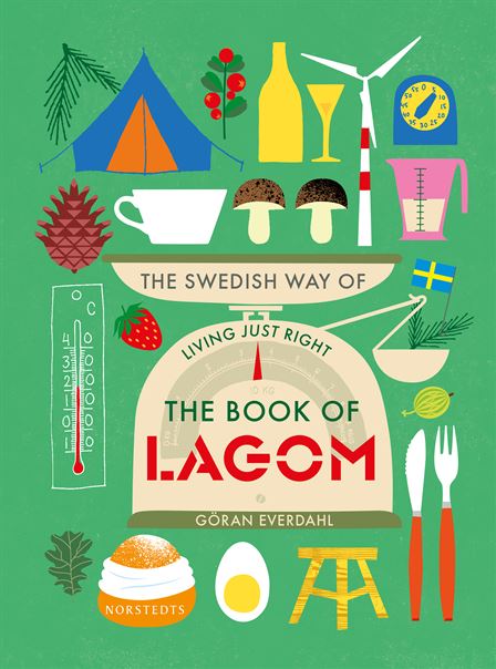


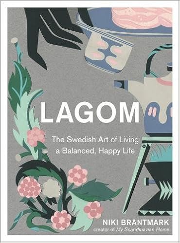


The Book 'Lagom', by Linnea Dunne of which I have chosen for one of my three books, has competitor books of which are about the same concept of Lagom. The lifestyle book covers all seem to carry a similar convention in their covers, with all being illustration based. Most of the covers, have used illustration to create a pattern design, or used many small images collated together. The book covers have the aesthetic of being a 'arty' book that will appeal to those who appreciate illustration. All of the book covers, but one have used a standard, bold sans serif font, with the title in capital letters. Also, all the covers mention on the front, how it's a book about Swedish lifestyle, perhaps because the imagery may suggest may different genres, not as obvious as say a horror genre.
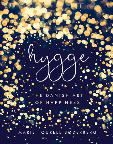
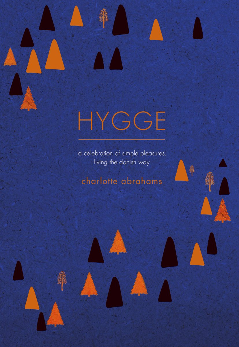
For the book 'The little book of Hygge' , the competitor books all have very different design features, with the most prevalent being illustration. Most of the cover use a sans serif bold font for the title, except from one which deters from the conventions entirely by using a 'delicate' handwritten lower case title. All use a shade of blue, perhaps suggesting nature, and a calmness to the book as the colour blue has a calming effect. For the book 'The little book of Lykke' there is no other competitors as such in the market, with the topic of Denmark being the happiest country popular with articles and tv shows, however it is has not translated into a book until 'The little book of Lykke'. The book cover follows the same conventions from the other book written by Meik Wiking, with using textured illustration, creating a layout around the title.
Friday, 12 January 2018
3 initial book covers group crit
use pattern more- with the excel pixel work working well
continue image across of back of book
technique of image and pattern
the idea of the pixels can be incorporated into the imagery of the jumper and nature, looking at what an unfinished jumper looks like
jumper and knitting- textile patterns
Christmas scenes-edge of tree- branches,
needs to integrate image behind colour
anni Albers- inspiration for the pixel type pattern
mid century modern - colour palette
research page- existing covers and analyse the cliches
hygge- needs to be contemporary
lykke- draw the flowers in a pixel way
for the typography, the title might be in the pixel style also
offset colours work
the pixel idea can link the back and front cover together
the pixel idea can link the back and front cover together
the excel design can be interpreted in the title of the book
can still use illustration- just link with the collage pixels, perhaps have the flowers drawn with this style
From this feedback, it is clear that my work is missing the design feature of continuing the illustration on the back cover, to which can be developed by using the pixelated idea scattered on the back cover. Also, the typography wasn't thought about in my designs, so I need to think more about the choices and experiment with incorporating the pixel idea into the title perhaps. With feedback that the jumper texture and pattern is a strong element to focus on, the idea will be tried with the covers, with using the different imagery in this way.
Thursday, 11 January 2018
Initial ideas


For the first set of book covers, the core principle was combining the research imagery to create 3d scenes that were then photographed. For the Hygge cover, the imagery chosen to be the focal point of the cover was the scene using the photograph of the toadstool, book, teacup and the flower excel pattern to which represents the books main message of how to be at comfort and peace within your life. The image was then resized and overlaid with the excel pattern, to add more depth and interest to the image. For the lykke cover, the imagery is more simplistic, with the use of the house and tree in order to symbolise the books main value of happiness, which can be reflected in the house. To further experiment with ways of which the scene can be captured in a picture, a viewfinder was made in the shape of a love heart and used to show the scene, which reflects the values of lagom, finding the balance of everything in your life, which will lead to a happy life. The set of covers have used the red, black and white colour scheme in order to keep the imagery consistent and to show the connotations of scandinavian contemporary design.
For the second set of covers the idea behind them was to have a focal illustration which represents the book. The illustrations have been made from the research tasks, with the photoshoots and the excel art. The illustrations incorporate a ‘grainy’ style of texture of which highlights the modern yet more visual style of book, of which was found with the existing boos in the genre. To add more interest to the covers scandinavian folk art has been used to highlight the origin of these concepts with also representing the prevalence of nature which is featured in all the titles. The type used is helvetica in order to keep the books main visual be the illustration, with the lighter colours used to highlight the ‘calm’ and ‘peaceful’ topics of which are mentioned in the books.
For the third set of covers, the same idea of having a main illustration to represent the book is used, however to experiment with the style of the illustration, overlapping block colours were used. The layout of the covers were experimented with, with having the title becoming central and bigger on the cover, which made the title become more clear. The folk pattern flowers were placed on either side of the title to add interest to the title, whilst adding a border of some sort. To make the front and back cover designs overlap more, the flowers were placed near the barcode, adding the extra detail to make the back cover more interesting and relate to the front cover more. Without the texture, the colours used become more lighter, and relate to the books more effectively, with translating the ‘calm’ themes of the book more clearer.
Tuesday, 9 January 2018
Marber grid one day brief crit
not sure what the theme is - fantasy style
the addition of the excel doc works best- gives some edge
the colour schemes work for each book- shows consistency
not heard/read these books, first thought is that its a romance book because of the colours and the use of the heart
develop by creating a back cover, maybe creating a wider scene that goes across the double spread
might need refinement as too busy
the hygge book with the pixels is best as it breaks up the image from just a photo
From this feedback, it is clear that I need to reevaluate the main imagery of the covers, so it represents the books better and focuses on the main content. Also, I need to create back covers, experimenting with the use of bigger scenes in order to wraparound. The colour scheme might still be able to work, just using less busy photographs and adhering to the books content more.
Marber grid day brief


Using the imagery related to the three chosen books, they were combined to create scenes, with the juxtaposition of the different aesthetics from the different methods. The initial pictures taken of the scene have been experimented to create different outcomes for the front covers, with cropping, zooming in and layering to create different results. The images were then positioned on the marber grid, with using the grid to position the books title and author.
Monday, 8 January 2018
Marber grid
Marber created a grid in which instead of just text based, uses image on 2/3 on the page
The design is based upon analysis of what needed to be retained and replaced
the three horizontal bands survived after slight adjustments
Two observations guided Marbers grid: first, the Penguin identity is synonymous with the goodwill to Penguin which has been created over many years
second, Penguin crime books are an integral part of this identity.
so, Marber retained the green as the series colour, with horizontal branding.
The image occupies over two- thirds of the space, with the title section split into three
Marber was planning on using white at the top of the cover to refer to the white on Young's design, before introducing all green covers at a later date.
With the structure, Marber could concentre on the images.
He was a graphic image-maker of great versatility, able to sum up the stories with motifs and ciphers. Many of the crime books were decades old, but his interpretations gave them a contemporary update.
For the base images he uses photography, energetically stylised drawing, collage with painted elements and flat geometrical pattern.
Other covers explore various kinds of photographic distortion.
The designs were usually created in batches of ten, with Marber not being precious about them, 'when you do a lot of covers it stops being a matter of life or death. You are not so tight about them that you want to make every cover a masterpiece'.
Saturday, 6 January 2018
Christmas tasks
For the tasks set over Christmas, the ideas were to have different means of creating designs of which most had a restriction and used a software of which its primary use isn't to create designs with. These tasks were set in order to stay away from the cliches and stereotypical first ways of designing the covers, making us think about the different ways to approach the cover designs.


2. The 2nd task was to use an excel spreadsheet in order to create designs from. This gave the restrictions with the colours used and the size columns, which created pixel style results.


1. The first task was to use a word document in order to create concrete poetry which reflect the books chosen. This allowed the first exploration of how typography can be used in order to create a design. For the designs words were used of which related to each book.


2. The 2nd task was to use an excel spreadsheet in order to create designs from. This gave the restrictions with the colours used and the size columns, which created pixel style results.


3. The third task was to listen to a piece of music of which relates to the books chosen, perhaps with the time period or origin. Then with the music chosen the task was to create music notation as a response. The task allowed the less obvious interpretation of the books, with using this obscure way as a rule to creating the designs. The music I chose to listen to for the task was a piece of danish folk music, as two of the books chosen had the origin of Denmark.


4. The 4th task was to take photos of objects that symbolise the themes in the book, looking for less obvious imagery that is mentioned in the books chosen. Two photoshoots were took, with the 1st one being primarily for the book Lagom, as the concept of Fika is an important aspect of the book. The second photoshoot was for all three book covers with objects used such as ; pine cones, logs, bells, trees, house, books, tea cup, toadstools, moss and textures such as jumpers, mats and rugs.
Subscribe to:
Posts (Atom)