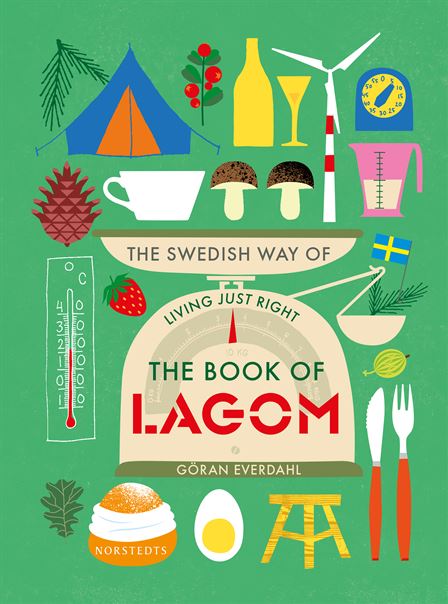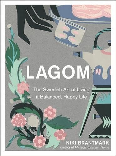


The Book 'Lagom', by Linnea Dunne of which I have chosen for one of my three books, has competitor books of which are about the same concept of Lagom. The lifestyle book covers all seem to carry a similar convention in their covers, with all being illustration based. Most of the covers, have used illustration to create a pattern design, or used many small images collated together. The book covers have the aesthetic of being a 'arty' book that will appeal to those who appreciate illustration. All of the book covers, but one have used a standard, bold sans serif font, with the title in capital letters. Also, all the covers mention on the front, how it's a book about Swedish lifestyle, perhaps because the imagery may suggest may different genres, not as obvious as say a horror genre.
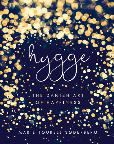
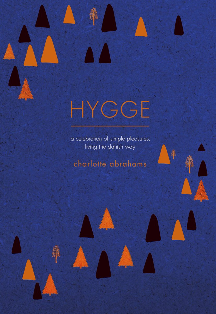
For the book 'The little book of Hygge' , the competitor books all have very different design features, with the most prevalent being illustration. Most of the cover use a sans serif bold font for the title, except from one which deters from the conventions entirely by using a 'delicate' handwritten lower case title. All use a shade of blue, perhaps suggesting nature, and a calmness to the book as the colour blue has a calming effect. For the book 'The little book of Lykke' there is no other competitors as such in the market, with the topic of Denmark being the happiest country popular with articles and tv shows, however it is has not translated into a book until 'The little book of Lykke'. The book cover follows the same conventions from the other book written by Meik Wiking, with using textured illustration, creating a layout around the title.


No comments:
Post a Comment