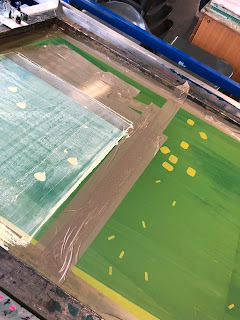
The final design for the map features two layers to screen print, with using a coloured paper to represent the background layer of the dessert. To test the different toppings, sprinkles and marshmallows were designed and exposed to see wether it would work better. With printing the first layer of the chocolate sauce, there was trouble finding the write colour of brown for the chocolate sauce, so different hues were tested. When found the write hue of brown, the first layer was printed onto the different colour stocks for variation. There was some trouble with printing this layer due to the screen getting sticky, and getting the paper stuck when printing, but it was found that this was due to the screen needing to be exposed again. So the screen was washed, dried and put under the UV light for 30 units to help the problem, which it did. With the 2nd layer, it took a while to try and get the perfect colour needed for the white chocolate chips, however I achieved an outcome of which I was happy with. As well as the chocolate chips, the other toppings were tested, with using the colour of pink and brown. The marshmallows didn't seem to work due to some not printing correctly, however they didn't look as effective as the chocolate chips anyway. The sprinkles work well, however would have been better if all different colours, however with screen printing this is too time extensive. It was decided that the light brown stock with the white chocolate chips was the most effective outcome.


No comments:
Post a Comment