Golden section
The gold section, also known as the golden ratio describes the perfectly symmetrical relationship between two proportions. The proportions are of a ratio of 1:1:61, that can be illustrated by using a golden rectangle, which is a large rectangle consisting of a square and a smaller rectangle. If you remove the square from the rectangle, you’ll be left with another, smaller rectangle, of which you can keep continuing the process. The golden section is most commonly found in nature.

Multicolumn grid
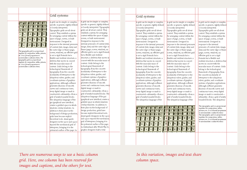
Multicolumn grids provide a more flexible format for publications of which require image and text. You can use the grid to section out zones for different type of content, in order to layout the publication more easier. The text or image can occupy a single column or can be in several. Columns can be dependent on each other or independent from each other, with the option to cross over design elements.
Hangline grid
As well as creating vertical columns of a grid, the page can also be divided horizontally. A horizontal line at the top can divide elements such as text and image, creating more of a structure. The body text can ‘hang’ from this common line, helping text and images to be aligned.
Modular grid
A modular grid has horizontal and vertical lines from the left to the right. They are created by positioning horizontal guidelines in relation to a baseline grid that governs the whole document. These grids govern the placement and sizing of images and text on the page. Designers including Brockmann made modular grid systems. There are endless variations.

Van der graaf canon
The Van De Graaf canon is a historical reconstruction of a method that they have been used in book design to divide a page into pleasing proportions. Also known as the 'secret canon' used in many medieval manuscripts for example. The construction of the canon works for any page width or height ratio. The most commonly used proportion is the 2:3. In this canon the text area and page size are of same proportions, and the height of the text area equals the page width.
Tschichold:golden canon
Looking at medieval manuscript and created the framework in which the ratio is 2:3, text area proportioned in the golden section. Tschichold’s drawings of an octavo-format page proportioned in the golden ratio or golden section ‘34:21’. The margin proportions and text area determined by the starting page proportions.
Tschichold: Octavo
The text area and margin proportions are determined by the starting page proportions. The gold section of this octavo format page is 34:21.
Muller - Brockmann: grid systems
‘The grid system is an aid, not a guarantee. It permits a number of possible uses and each designer can look for a solution appropriate to his personal style.’ Brockmann adapted his use of layout with each project, with the graphic form having to link to the layout.


No comments:
Post a Comment