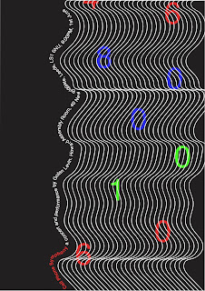
From the final poster that had peer critique, tit has been developed further, with the main points to test with the typography and change the colour scheme in order to better represent the concert.
In fig 1 the poster has been developed by inverting the colours, with having the background become black. It was decided that with being black it gives the design a different tone to it, representing the concert more because of the more digital look. With using black it also represents the concert being dark and having the lights of the mobile phones when used in the performance.
In fig 2 the poster has been developed by changing the colours of the numbers to give more context. The colours used are RGB red, blue and green which represent the colours which were shone of the stage on the computers of which were controlling the performance. With these colours it represents the symphony more and also looks more digital, giving a vibrancy to the poster.
In fig 3 the poster has been changed from having the black background to white. With the simple change of the background colour it changes the tone of the poster, making it less effective to represent the concert as the ‘squiggles’ are less vibrant and the poster is quite ‘dull’ not representing the innovative aspect of the concert.
Fig 4 has been developed with trying different ways of making the text become more visually exciting on the poster, after critique that stated that the initial text used isn’t very interesting. Using the lines on the poster a path was created to add the text to, following the layout of the text from the previous posters. The text following the curves seemed to take away the main visual element of the lines, making them less striking.
Fig 5 is exploring the different ways in which the text and curve elements can be combined on the poster, using the idea of having the text follow the curves, with instead having the type form the rest of the design in a continuous line. This design worked better than the previous but however again doesn’t work effectively with the rest of the design and the layout that was already made.
Fig 6 is exploring with the type further, looking at how the type can be made to have a digital connotation that better represents the concert. When looking at the time the concert was held and what technology was popular at that time period, it was found that the Nokia 8210 was a popular mobile phone. With this model of mobile phone most likely have been used for the concert, the type was then found and incorporated into the poster design to represent the digital time period and also the social interaction with the use of the mobile phones. This design was found to be the most effective as the type doesn’t take the impact away from the line visual and is more interesting and contextually developed from the first initial idea of this design.
1. 2.
3. 4.


5. 6.
Final:


No comments:
Post a Comment